I feel fortunate to be able to attend the presentation of Dr. Tamara Munzner who is the author of the following excellent data visualisation textbook used at many universities around the world:
Tamara Munzner. Visualization Analysis and Design. A K Peters Visualization Series, CRC Press, 2014. (link)
Date: Wednesday 21 June 2017
Time: 2pm – 3pm
Location: H7.84, Caulfield Campus.
For me, computer-based visualization systems provide visual representations of datasets designed to help people carry out tasks more effectively. Thus, visualization is suitable when there is a need to augment human capabilities rather than replace people with computational decision-making methods.
It was interesting to note that visualisation systems can be a great way to build trust before deploying or automating a tool or system. However, when designing any system, there should be an intended task with measurable definitions of effectiveness. Many a times, visualisation experts attack a problem with their own weaponry of visualisation techniques and try to frame the data and eventually the problem to suit the tools they have. It is extremely important that tasks should be the driver for any visualisation (problem-driven work).
To achieve this one can use a nested model of data visualisation:
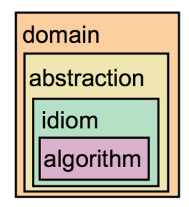
Source: A Nested Model of Visualization Design and Validation. Munzner. IEEE TVCG 15(6):921-928, 2009 (Proc. InfoVis 2009).
- domain situation
- who are the target users? what are their needs & concerns?
- [Did you misunderstand the needs?]
- {Validation Solution: Measure adoption}
- abstraction
- what is shown? why is the user looking at it?
- [Are you showing them the wrong thing?]
- {Validation Solution: Observe target users after deployment (field study)}
- idiom (Visual encoding/interaction idiom)
- how is it shown?
- [The way you show it, does it work?]
- {Validation Solution: Analyse results qualitatively}
- {Validation Solution: Measure human time with lab experiment (lab study)}
- algorithm
- efficient computation
- [Is the code too slow?]
- {Validation Solution: Measure system time/memory}
- {Validation Solution: Analyse computational complexity}
Some pitfalls to avoid in a data visualisation project (from the 32 listed in ):
- premature advance: jumping forward over stages
- premature start: insufficient knowledge of vis literature
- premature commitment: collaboration with wrong people
- no real data available (yet)
- insufficient time available from potential collaborators
- no need for visualization: problem can be automated
- researcher expertise does not match domain problem
- no need for research: engineering vs. research project
- no need for change: existing tools are good enough
- mistaking fellow tool builders with real end-users
- pre-mature design commitment: consideration space too small eg.
- Collaborator: I want a tool with that cool technique I saw the other day!
- Viz Guy: Of course they need the cool technique I built last year! 😉
- Think Broad !!
- experts focussing on visualisation design vs domain problem
- nonrapid prototyping
- usability: too little/too much
- usage studynot cas study: no real task/data/user
When selecting projects, it is important to have a winnowing process, that is, having initial conversations with many potential collaborators before proceeding to further meetings with a filtered list. After the meeting, the team can proceed to prototyping for a few clients (say 2-3) before finally committing to a full collaboration partner.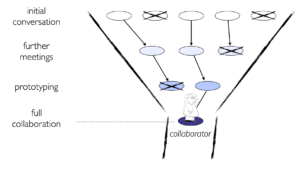
Finally, I feel a true evaluation of a visualisation tool can be summarised as following:
… Take something you already know … and see how long it takes you to find in this new tool? … what new things can you discover? …
Reference Slides: Presentation


